Introduction
Quantifying player styles is something that hasn’t been done much before in hockey. While a meta picture on player evalutation is widely offered through WAR models and other catch-all statistics, the key question of how a player gets results remains unanswered. Ryan Stimson has looked at this topic before using clustering but I am building onto that. I believe my method provides a greater aggregated look at the areas of strength for each player.
Data
I use a combination of data from the NHL as well as hand-tracked data from Corey Sznajder. This means my dataset includes shots as well as their locations but also the micro-stats that Corey tracks. All this data put together offers a complete image of a player’s game; however, it’s a lot of data to parse through and understand. Simplifying this was my initial motivation to building a model which uses principal component analysis (PCA) to reduce the data. All players with over 75 minutes of tracked ice-time were included in the analysis and forwards and defenders were separated
Method
Now you might be wondering what exactly PCA is. Essentially, the PCA ‘cleans’ the data by reducing a large number of related variables (entries, exits) into simple broader dimensions (transitional play), and isolates them from uncorrelated variables. This means that the data which previously had 32 columns of stats, now has far less by combining the columns with similar variables. Once the PCA was done, I applied a varimax rotation to it to ensure the maximum variability was captured in each factor.
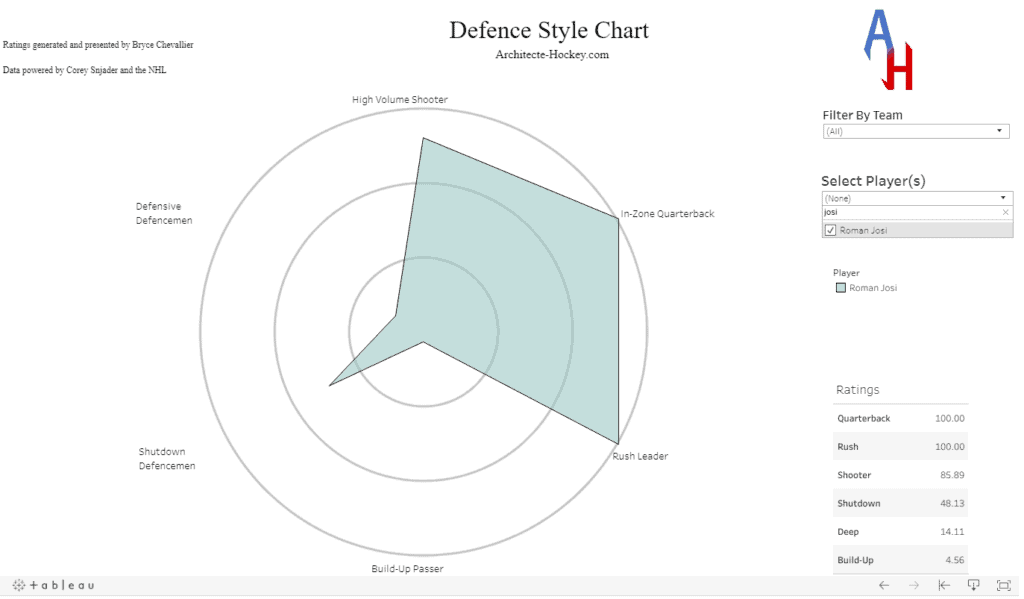
The most important feature of this method is that it doesn’t box players into a category like other clustering methods. This allows me to assess which players rate high or low on certain attributes, and get a complete view of a player’s profile. Certain players such as Roman Josi can rate highly in multiple areas of play.

There are many ways to decide how many components should be kept but I went with six. The analysis suggested six components was the best way to capture the greatest variability in the data with the fewest components. These two features are important as we want to capture the entirety of a player’s game, but we also want it to be understandable in a simple chart.
Uses
Once all the data is gathered, we can have a good overview of how a player contributes in different phases of play. The first use of this is finding similar players to each other in terms of the roles they fill for their team. If you want to have a look at that, there is an interactive dashboard for site members here. This can be a valuable tool for identifying players that could fill in weaknesses on a roster or within a line.
What I have noticed, and will write about in the near future, is the way the top performing lines cover each category. This suggests that building lines that maximize these components is helpful to success. Ultimately, line-up optimization and chemistry between styles is an area of research that can benefit greatly from this perspective on player evaluation.
The other project I have on its way for site members is using these simplified categories to run a clustering algorithm and find specific player roles, so stay tuned for that write-up.
Limitations
This is of course not the perfect metric. The obvious limitation is that matchups are not considered. This means that just because a player in a lesser role performs better in a category than a superstar, it doesn’t mean he’s better in that area of the game. This is why I say the numbers measure style. A player scoring highly should be taken as indicative that he performs many actions realated to the category given his role, matchups and icetime.
Results
If you are interested in getting more details about the categories and what they represent, check out part two and three describing the components for forwards and defencemen.

